Date
November 2019
Time span
Two weeks
Client
Ironhack UX / UI Design Bootcamp
Subjects
UX Research・UX Design・UI Design・Prototyping
1. The company
Smart People Inc. is an educational company born in 2014. They currently offer in-person language courses — English, Spanish, Italian, French, German, and many more — for young adults from 18 to 21 years old.
Their main attraction is a summer camp. Hundreds of youngsters join every year in different locations, as they have an exceptional recipe: they integrate sports, outdoor activities, technology, humor, games, and other cool stuff to their mission of teaching a second language.
They’re finding many students are unable to attend the summer camp due to cost and time reasons, but still want to access the curriculum.
Pre-Determined Goals
Our mission for this sprint is to make the Smart People Inc. summer camp curriculum accessible to students that are unable to attend due to time and money constraints. We are a team of three to create a minimum viable product (MVP) by the end of this 2-week sprint.
Our users’ age range is 18 to 21 years old.
How can we help these young adults learn a language entertainingly and engagingly?
2. Planning our approach
We had two weeks to work on this project in teams of 3.
Although we each had our specialties, we tried switching between roles to keep an eye on every step of the design process.
Not only did we divide the work equally, but we communicated a lot as a team to agree on our goals and be more efficient. We decided on a UX strategy and started writing the survey questions. We also did benchmarking on summer camps and language learning.

Following the Agile methodology, we had daily stand-ups in the morning to know what has been done, what needs to be done, and what problems need to be resolved. We also shared a checklist of tasks to complete for each day on our Slack channel and on Trello, to make sure we were all on the same page.
Our roles in the project
Even though we decided to divide the task effectively, the three of us wore many hats for this project:
User researcher
This included setting up a meeting with the users, both online, in person and over the phone, gathering data via interviews, surveys, and discussions.
This included setting up a meeting with the users, both online, in person and over the phone, gathering data via interviews, surveys, and discussions.
Information architect
When people navigate a page or an app with ease, it was not by accident. Concerned with the navigation of the product, and it is their job to plan the structure of the page and the site so that users can reach their end goal in an intuitive, logical way. The information architect is also concerned with helping users fully understand where they currently are on the site.
When people navigate a page or an app with ease, it was not by accident. Concerned with the navigation of the product, and it is their job to plan the structure of the page and the site so that users can reach their end goal in an intuitive, logical way. The information architect is also concerned with helping users fully understand where they currently are on the site.
User Interface designer
A User Interface designer is responsible for the look and feel of a site. Using the research gathered, the User Interface designer seeks to create a clean and functional design based on the requirements already identified.
A User Interface designer is responsible for the look and feel of a site. Using the research gathered, the User Interface designer seeks to create a clean and functional design based on the requirements already identified.
Usability Tester
A usability tester is in charge of evaluating a product by testing it on groups of users to check its functionality, usability, and ease of use. From this feedback, the product can then be redesigned and improved upon.
A usability tester is in charge of evaluating a product by testing it on groups of users to check its functionality, usability, and ease of use. From this feedback, the product can then be redesigned and improved upon.
3. Research and results
To start collecting user data, we used these tools: user surveys, Jobs-to-be-done (JTBD) interviews, and market research.
Our surveys specifically targeted 18 to 21-year-olds and were in two versions (English and French). Since we didn’t have the budget for paid surveys, we were looking for free users. Facebook groups were beneficial, as were our close connections.
In parallel to sending surveys and doing JTBD interviews, we decided to do our market research and competitor analysis.
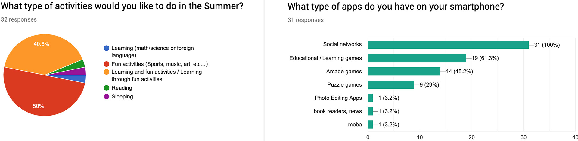
Quantitative data: survey results
We collected thirty answers for the English survey and thirty answers for the French survey. The data revealed that socializing and being active while learning was very important for our users:
Qualitative data: JTBD interviews highlights
We had three jobs-to-be-done (JTBD) interviews, and we discovered that social interaction was a valuable learning aspect for our users. These young adults we interviewed were very enthusiastic about the subject, giving us tips and telling us stories about their learning experiences online and in real life.
Here are some of the interviews’ highlights:
Here are some of the interviews’ highlights:
“ It’s hard to replicate a summer camp online.
We need the energy and emulations of group activities. ”
We need the energy and emulations of group activities. ”
“ I'd like an application to be fun and I'd want to feel the community effect. ”
4. Defining the problem
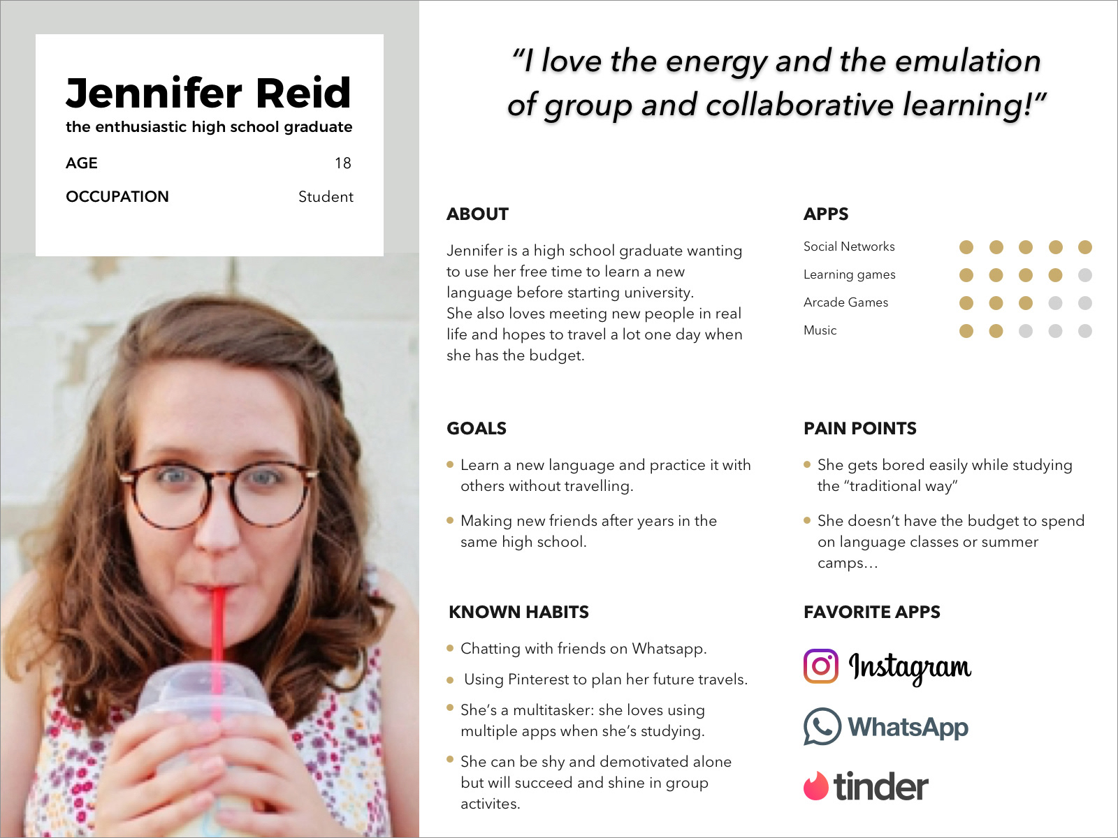
User Persona
Based on our interviews, our research, and our results, we created our persona, Jennifer Reid, an enthusiastic 18-year-old high school graduate.
User Journey
We also tried to understand her learning journey with a typical language learning book.
The main pain points are aligned with the loss of interest and boredom moments you can notice in her journey.
The main pain points are aligned with the loss of interest and boredom moments you can notice in her journey.

Data download: Affinity diagram
After collecting data and interview insights, we had to choose a tool to download our data. We agreed on an affinity diagram ; we felt that a lot of common subjects were standing out from our results, and we needed a way to reveal these subjects. An affinity diagram is a method used to sort and organize research findings so that one can physically see trends and relationships in data.

The Problem Statement
After downloading and analyzing our data, writing the problem statement was a bit of a challenge for us. The first drafts were either too broad, too vague, or tackling too many problems at the same time. We kept going back to our data to finally come up with a solid problem statement:
Jennifer, an enthusiastic high school graduate, needs to learn another language while socializing because she wants to be bilingual, but she’s struggling to stay motivated learning by herself, she feels lonely & bored.
How might we help her stay motivated and entertained while learning?
5. Ideating
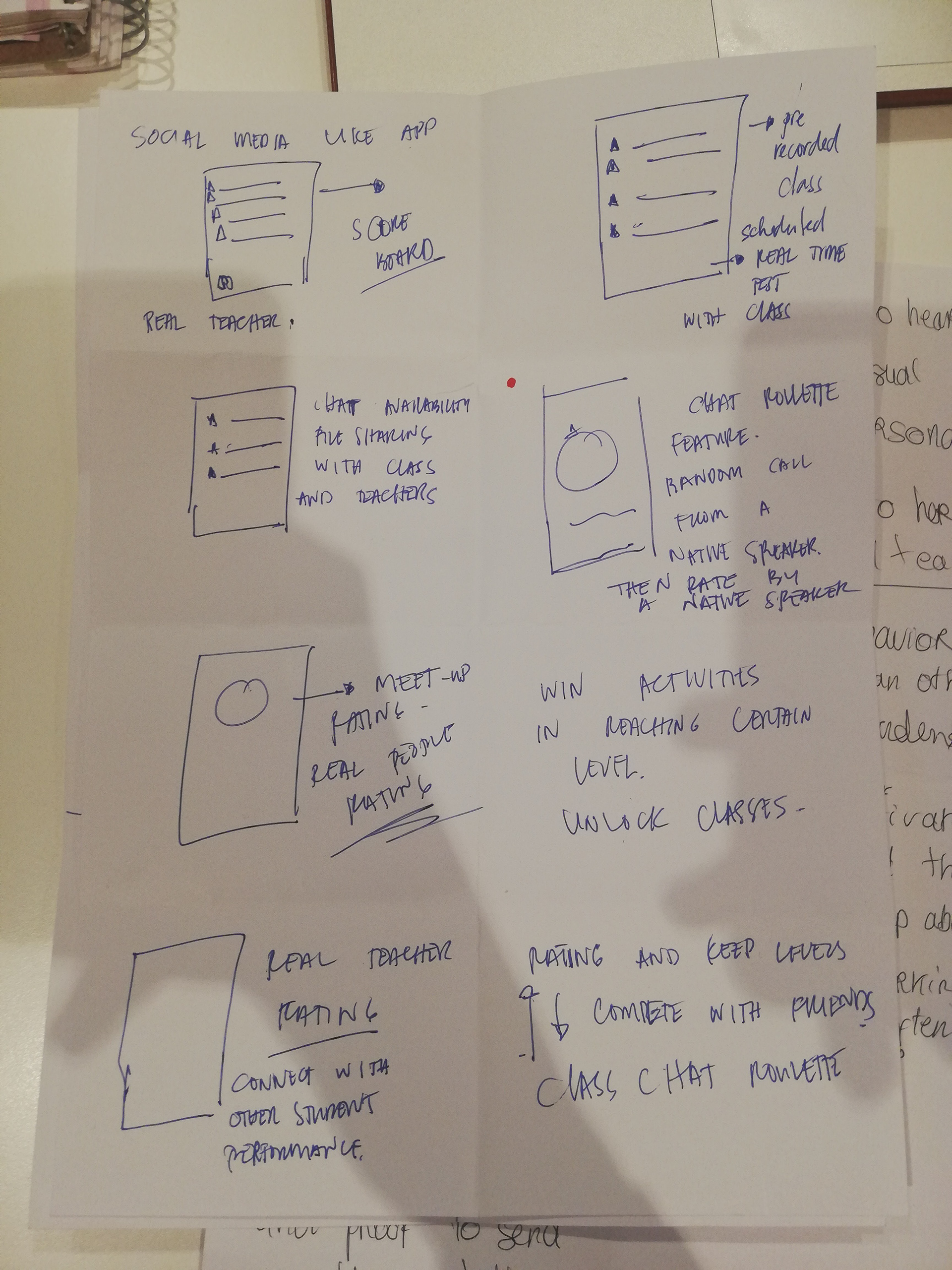
After defining our problem statement, we decided to start the ideation process. Through idea generation or ideation, we generated as many ideas as we could at the time. We then refined these ideas by dot-voting to concentrate on a selection of ideas.
Crazy-eight
Crazy-eight is an ideation exercise where one comes up with 6 to 8 crazy ideas in 8 minutes (1 min for every idea).
After dot voting, we chose two main ideas and iterated through a quick round-robin exercise (each person uses their neighbor’s design as inspiration to iterate and create another one).


Low-fi wireframes and wire-flow
Before moving to the mid-fi prototype, we quickly drew a wire-flow, a mix of low fidelity prototype, and user-flow (the earlier you test, the easier it is to fix an error).
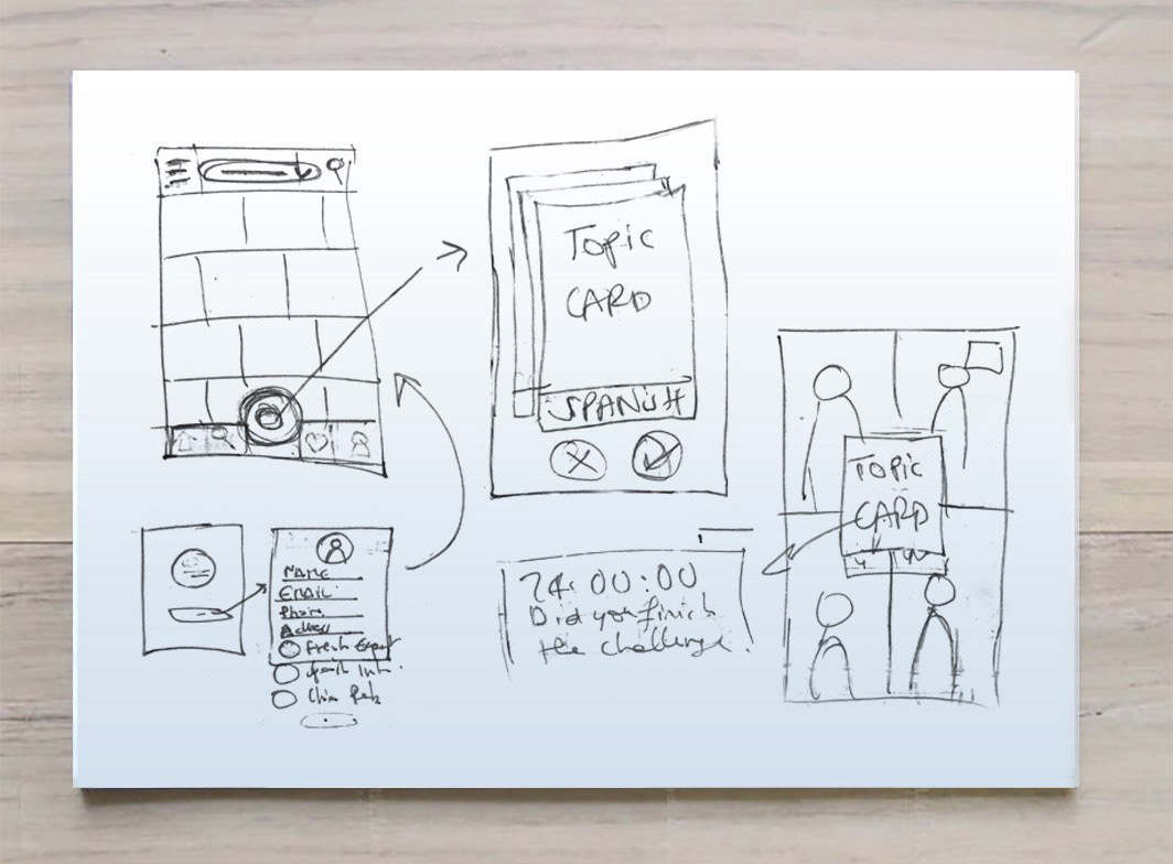
An example of our low-fi user flows
6. Mid-fi Wireframing & prototyping
Mid-fi Wireframes
Design solution: Make a language learning app that feels like a game while keeping it social so the users can practice with each other. Our application connects our users with others with same interests. Upon sign up the students has the option to choose which language he/she wants to learn.
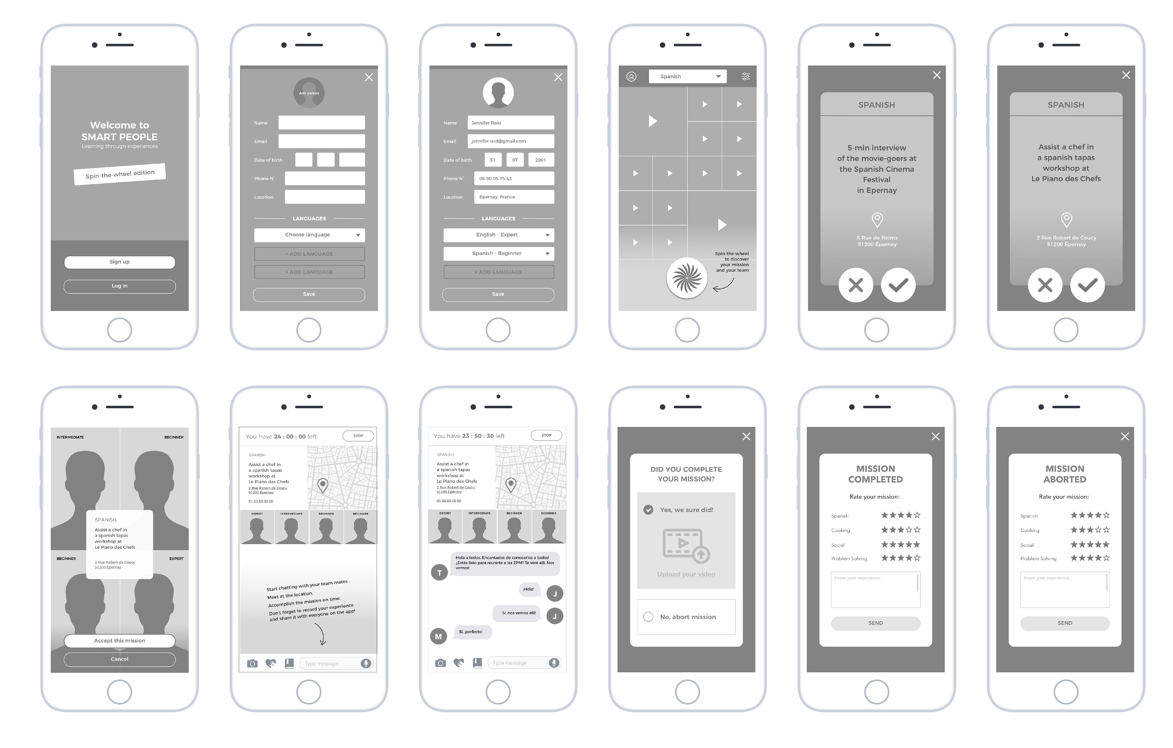
The spinning wheel: it randomly picks its mission, and the users are then randomly teamed with other users. Once the mission has been accepted, the team has 24 hours to finish the task.
The mini-missions: their purpose is to have the users learn by this pain point: Jennifer finds it challenging to stay motivated and engaged in an online learning app.
The mini-missions: their purpose is to have the users learn by this pain point: Jennifer finds it challenging to stay motivated and engaged in an online learning app.
Mid-fi Prototype
Our mid-fi prototype recording:
Our mid-fi prototype live in Marvel:
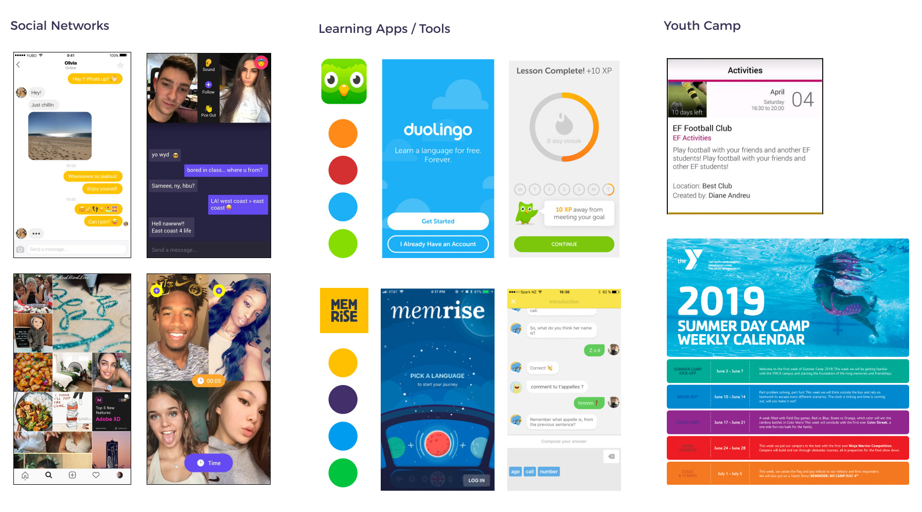
7. UI Research & Benchmark
Since we were a team of three UX/UI designers working on this project, we divided the UI research and benchmark into three themes: Social Networks, Learning Apps/Tools, and Youth Camps Communication.
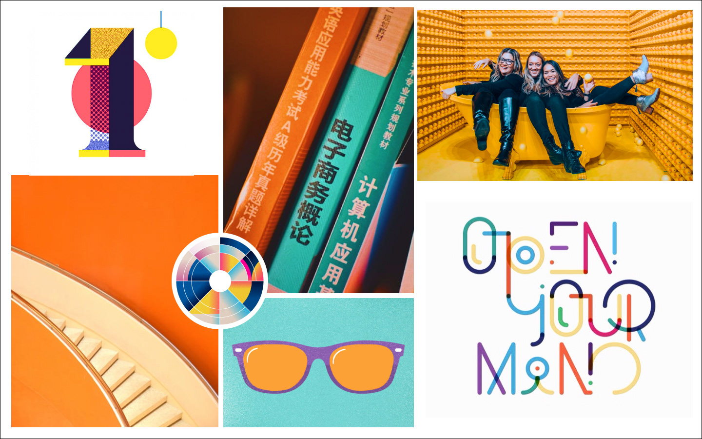
8. Mood Board & Desirability Test
A mood board is essential to set the tone at the beginning of the project and to define the direction our team wants to take.
When we started to define our project and its users, we first set our mood: lively, active, and youthful.
Our user, Jennifer, shouldn’t be only looking forward to meeting new people but also to use our fresh and cheerful solution.
Every color palettes, textures, and typography that we selected was a step forward towards this direction: a group of young friends having fun in front of a bright background, colorful language learning books, but also playful typography and iconography.
We measured people’s attitudes toward our mood board and our homepage design with a desirability test: we gave our users a list of 40 product reaction words and asked them to select those that best described what they saw (they only had 5 sec to discover the visuals):
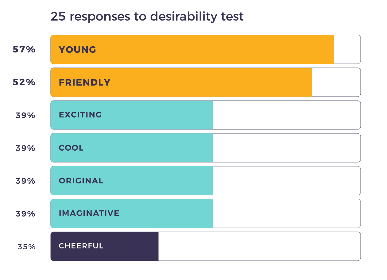
More than half of the users defined our mood board and our first screen as “Young” and “Friendly”.
The selected reaction words comforted our team in the mood and color decisions and allowed us to continue our path through the style representation of the app.
9. Style Tile
Defining a project style tile can be done through the display of the designed elements that you used, as a visual reference. What we aimed for was a consistent design identity to facilitate teamwork.
What would be a primary color if there weren’t any secondary colors to enhance it? Our hero color is a mustardy yellow, supported by two fresh colors (magenta, turquoise) and a dark blue that boosts the light of the design elements that are put against it.
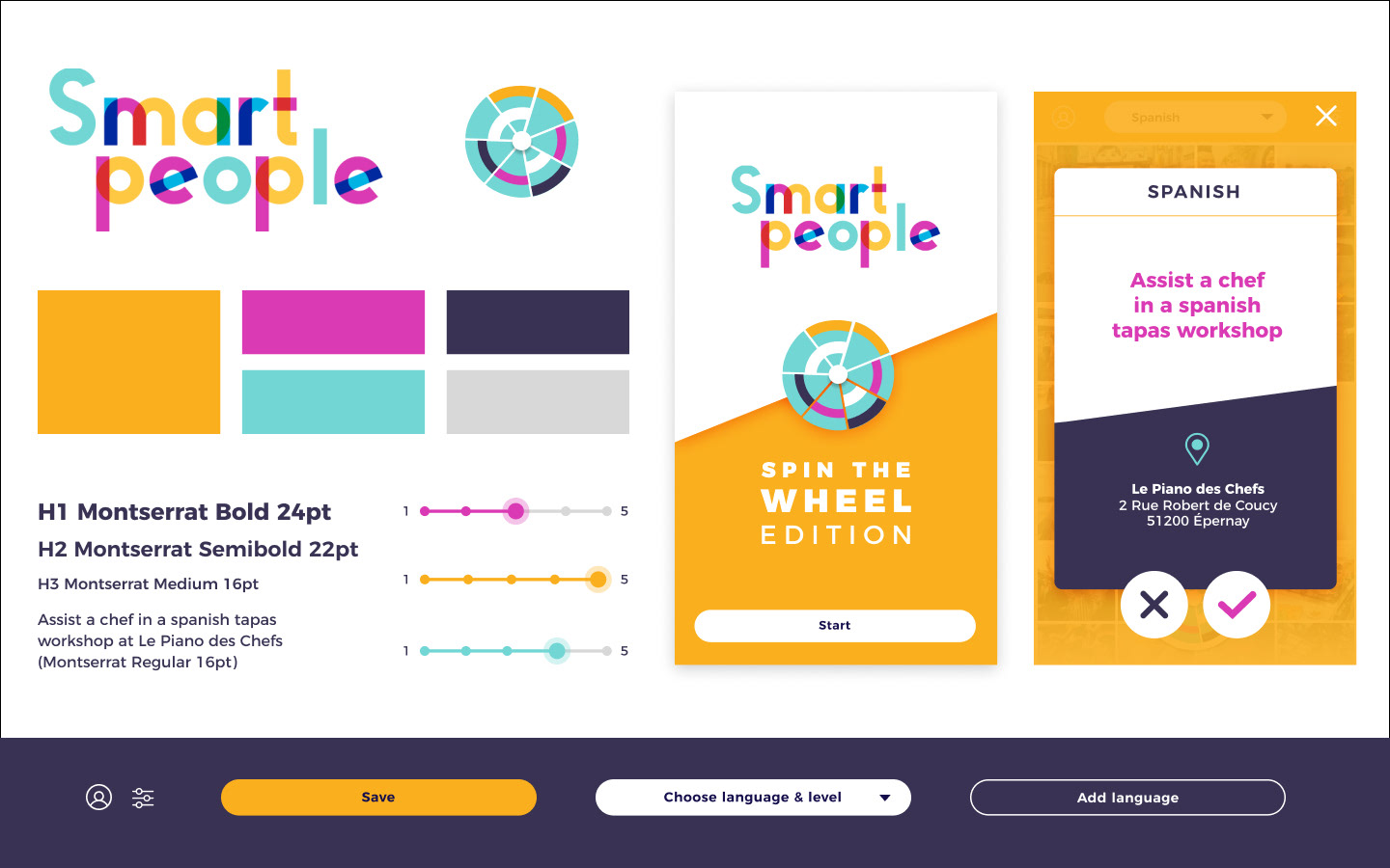
The Montserrat font family was chosen for its usability, practicality, and scalability. It is functional and modern, but it does not ignore design aspects and can combine this with a lively and open character that gives it charisma and attractiveness. The result is a sans serif typeface with many variants and various opportunities of use, both in print as well as online, since its also part of Google Fonts.
We represented our main feature, the random mini-missions, through these two UI elements: the Wheel and the Mini-Mission Card. Those components will also be in the center of the spotlight through our micro-interactions all over the app.
10. High-Fidelity Wireframing & Prototyping
After defining our mood board and elements of our style tile, our solution began to take shape. With every screen designed, we were affirming its identity and were aiming for a bold message to Jennifer and her peers: yes, one can socialize and have fun while learning a new language.
Smart people’s visual identity isn’t about mimicking a youth summer camp or any mainstream learning app; it’s about listening to one’s affirmed and energetic personality to adapt instead of applying a predefined cast to it.
The following overview of our high-fidelity wireframes shows how our solution can be an open stage to create not only endless learning possibilities but also fun and unforgettable social experiences.
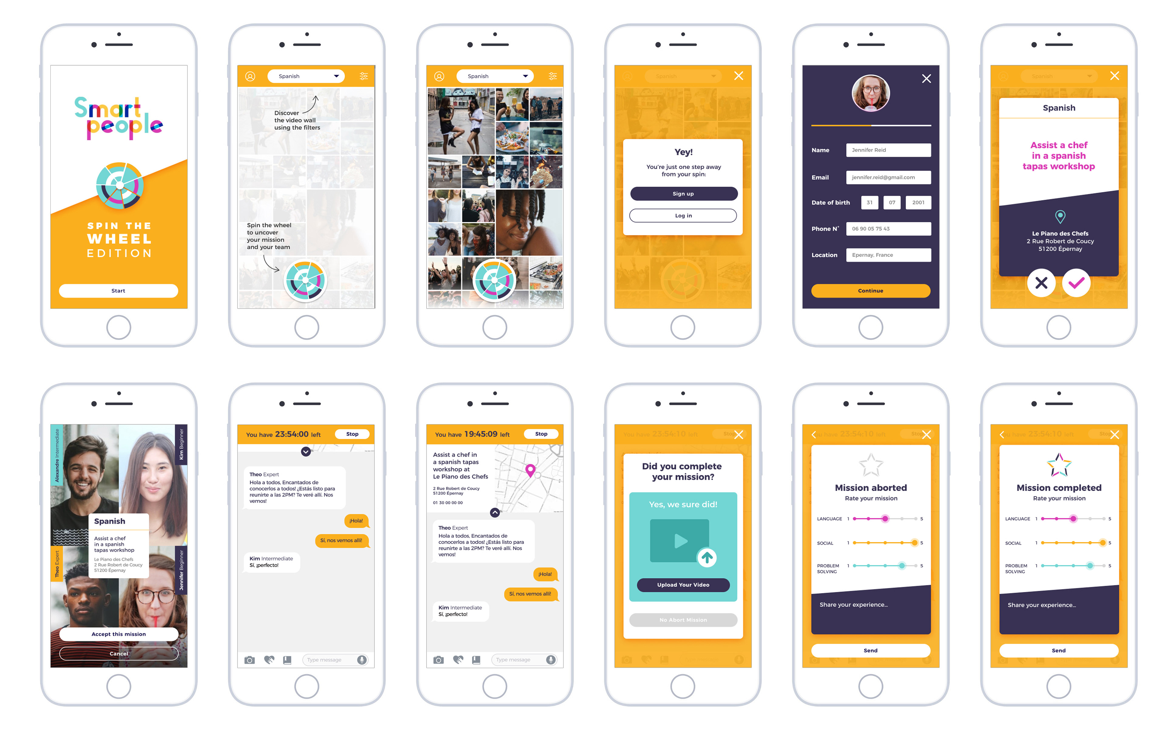
Our solution can be tested through our interactive prototype with the following user scenario:
The user is 18–21 years old, he or she heard about the app and wanted to check it out. He/She wants to sign up to meet new people and to learn Spanish; the aim is to get assigned a mini-mission and a random team.
Our high-fi prototype recording:
Our high-fi prototype live in Marvel:
Microinteractions
As I said earlier in this case study, our main feature, the random mini-missions, was represented through these two UI elements: the Wheel and the Mini-Mission Card. Our sample micro-interactions allow us to put light on them.

We aim to have the wheel spin once clicked to assign a random mission card (it would also auto-spin once the user opens the app for the first time). For our mission cards, a simple card-swiping will allow us to give a user-friendly approach to missions’ selection.
11. Usability tests & next steps

We had six users for our usability testing aging from 18 to 21.
One main observation was the confusion about what should happen next after reading the chat screen instructions. After a quick iteration, we added a button to start the mission and “Let’s go” as a call-to-action text.
Our users’ insights were mostly positive; they loved the feel of the app.
They mentioned how the color palette puts them in a happy and playful mood. The app allowed them to be proactive and creative while having the support of more experienced peers.
They mentioned how the color palette puts them in a happy and playful mood. The app allowed them to be proactive and creative while having the support of more experienced peers.
A bonus for the users was the possibility to rate the missions: this solution is an iterative process not only in UX / UI design but also in the quality of the random missions proposed to the users.
A fun fact was one user exclaiming, “But I don’t understand, why can’t we register for real?”.
This case study was published on Medium largest active publication "The Startup", you can read it here.